
I have experienced something of an epiphany, if that is the right word for it, in recent months, changing from a positive if no longer proactive human induced climate change supporter to a more skeptical role where I see the events unfolding in the natural world more as being, well… natural. I saw climate issues and our involvement in them in a new light though never with quite a satisfying overall picture. Until in my nocturnal mental meanderings overnight, last night, it all became clear that we are not the destroyers of the planet but actually its saviours, if you like. And, if you don’t like, then at least acting as the catalyst in that salvation, having been injected into the situation in relatively recent times to achieve just that as part of some cosmic plan or, if you don’t like even that, as active bystanders in the process. I will endeavour to explain.
But first let me set the scene. I described in a previous post the first of three severe risks to the planetary wellbeing, and promised to describe the other two risks. The risks are still very real, but I think a solution may already be in coming into operation. I will describe that later. In my previous post I said I still wasn’t sure if the final two risks could be fused together. Now I am sure.
We need to go back 500 million years to grasp what the prevailing conditions have been, and I use once again the same image used in my first recent post on the subject. Take a good look.

It can easily be seen that from the earlier ages of formative chaos prior to the last half billion years of Earth’s history the planet has settled into what I have described as its basic operating envelope for climatic temperatures, somewhere between 33°C (92°F) and 10°C (50°F) of mean average temperature, with many swings going full distance between those extremes but never outside of them. Notice that within the last 200 million years the upper boundary of the envelope has reduced to 30°C (87°F) .
Notice also that within the last 65 million years there are rather more minor variations in temperature and that, after a long absence, polar ice-caps started to reform as the boundary of possibility for such phenomena was crossed at around 20°C (67°F). This was a period of general cooling of the planet, not for the first time.
It is as if the planet has been struggling over the whole of this period to bring about more moderate conditions, epitomised by the 20 million years or so following the re-establishment of the polar ice-caps during the relatively balmy days of the Oligocene and Miocene periods. Sadly, this idyllic period could not be held together due to the reason I gave in the previous post on the First Severe Risk, and cooling continued apace.
We need to examine that last 65 million years of struggle more closely, and I will again use the same image as in earlier posts to do that.
Incidentally, the sharp uptick at the extreme right of first, 500 million year chart should be ignored, as should most of the dip which precedes it. It is some artificial, introduced confusion to give the impression that temperatures are rising, and since the granularity of the data at this scale is insufficient to show actuals (the thickness of the line being roughly a million years), no such detail – only the current trend – should be shown. This is an example of wishful thinking, the actual trend line showing no such uptick or dip at this stage as, we shall see next. The blue line should exit the chart at roughly the 12°C (55°F) level. In other words at exactly the same level as the red line in the image below.
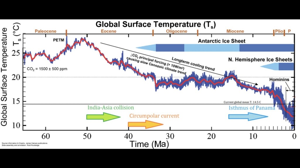
Aside from beginning with the extinction of the dinosaurs (off chart to the left), followed by the marked PETM – the last extreme of heat (sharp uptick in the blue line) – this last 65 million years has also seen the splitting apart of the super-continent of Pangea and the movement of large land masses to form the world as it more or less settled to be today – though continental movements still continue.
I have analysed this image before in great detail. There are just two things I wish to point out now and they represent the remaining two severe risks I identified.
First, let me say it is really unusual to find such a clear temperature scale as the one used in this chart. Represented are actual Celsius degrees of GMST rather than some obscure anomalous numbering system. Importantly, the ongoing cooling of the planet is perfectly obvious and it is easy to see that aspect took a rapid increase in the speed of decline around 5 million years ago. None of this is ever acknowledged by climate change enthusiasts. The red GMST trend line shows us that it now stands at less than 12°C at the right border of the chart, only 2°C above the absolute lower operating boundary of the planet’s temperature envelope. This is the first time period in more than 270 million years (perhaps even in 500 million years) that the planet’s average temperature has even approached such a low level (refer to the first chart) – and that is important to remember and acknowledge when making any conclusions about the status of climate conditions today. Climate change enthusiasts never do acknowledge that. So it could be accurately stated that we are currently approaching planetary Ice-Ball territory. Check for yourself. Look at other such charts of the period. And that is the Second Severe Risk of which I spoke.
The question is, and I hope you can see the risk of a potential decline below that 10°C level, will that boundary be overstepped, and when? Actually it already has at a couple of wayward data points. Bear in mind that if or when it reaches 0°C, pretty much all the planet will be under ice.
The Third Severe Risk pertains to the increase in frequency and severity of the perturbations occurring around that GMST trend line since about 40 millions of years ago, and what exactly such activity may presage. As I said earlier, I think there may be a connection between these two phenomena so I am going to treat them together as being related. We need to examine this more closely, to see how realistic those dangers are.
The perturbations of actual temperature variations are now widening and broadening from anything ever seen before. The blue lines of actual data points are tending to spread further above and below the trend, as time goes on. This unusual activity pattern took a dramatic increase in severity around 5 million years ago leading to false impressions, among those who study such things, about just what exactly is going on. Rash ideas have been formulated, based on recent data points, which has led to the current panic conditions among humans, because ideas based on the individual data point (each representing a single year actual GMST) rather than the general GMST trend line are grossly misleading. This is the sole reason why some folk can say we are heading for a frozen planet while others can equally mistakenly say we are heading for a boiling planet by focusing on individual data points. It is only when the broader picture is taken as the base level that these swings can be properly interpreted. Take another look at the chart above to make sure you agree and to satisfy yourself that I am not making this up. Although the general GMST trend line does show the actual cooling trend very clearly, and equally clearly indicated that it must soon be reversed if an icy disaster is to be averted.
There has already been at least two incursions within the recent downward swings (the blue line) which has taken our situation into that area of foreboding danger, the area of sub10°C icy conditions. There have also been points that have reached positions far above the current trend line into the hot region of +15°C. And it is easy to see this as the cause (falsely justified) for the current climate disaster thinking among vulnerable humans.
[Of course I am aware that these phenomena could also simply be the result of more frequent, more comprehensive, and more accurate measurements as technology has enabled such things. But these increasingly aggressive perturbations have been ongoing now for far longer than such enabling technology has existed within the experience of our species. And they are getting worse, and always subverting the thinking of insecure (because they have no real background knowledge) humans. Despite the odd data point which temporarily indicated that temperatures are rising, the actual trend shows a mean which is continually falling. Or does it? We will see as we delve a little further]
What does this frenetic confusion of rapidly fluctuating ups and downs remind you of? To me, this signifies something, some machine, some complex system, which is seemingly about to suffer a catastrophic breakdown. The frantic struggles of something to avert an impending event. Or… something, to the contrary, which is braking violently (that’s ‘braking’, not ‘breaking’) to turn around to head in a different direction. I like that analogy. The planet trying to stop where it is headed (a barren, desert world, with little to no life) and to return to what it once was, some 20 to 40 million years ago, a fruitful, blossoming world, teaming with diverse life and enjoying a pleasant climate over much of its surface. Now there’s a happy thought to contemplate. Except that those conditions did not hold for long. Although twenty million years is far longer than our modern species has even existed – and the world did suffer some dramatic and unsettling cosmic and terrestrial events during that period. We should hope for just another such opportunity in what may, geologically speaking, be more settled times.
I now introduce, actually reuse, another chart image which will explain more clearly what is happening. The top charted row represents the past 5 million years of temperature variations (the dark blue lines) from the GMST trend (light blue line), which has been continually falling, apart from two slight rises more than 4 million years ago. For the watchful, the GMST trend line appears to be rather more shallow than in the previous chart. This is simply because the horizontal scale has necessarily been stretched somewhat in order to reveal further detail which so far has not been obvious. Unfortunately, the chartists regressed to using an obscure anomalous temperature scale relative to ‘Peak Holocene Temperature’ on the vertical scale. The ‘Peak Holocene’ GMST referred to in the chart title is misnamed. It is actually the current GMST temperature we now have, which is ~14.5°C, but since this chart dates back to around 2010 when the ‘current’ GMST was lower, I think we can estimate it as being 14°C. The actual ‘Peak Holocene’ stands at around 15°C or even a little higher, but the data doesn’t fit if we allow the zero line to be higher than 14°C.
Note that none of these things are the same as the GMST trend – which at the moment is incalculable* but at its last calculated point stood at a little below 12°C and is another thing that tells us our estimate of 14°C is on roughly the right track.

* Notice the trend line stops around 270,000 years back. This is because it is a moving (or rolling) average. Today’s GMST trend will not be accurately know until 270,000 years in the future. But since it appears that most of the data points of the past 270,000 years seem to be above that point, rather than below it, it is likely that there has been a slight uptick in the trend. This is hopeful for the future, and is borne out by other studies I have seen recently. The tide is rising, so to speak, but not as a result of human climate mitigation efforts – which are mostly worthless and would be dangerous if they were anything other than that. We must produce more CO2, not less. Have I said that enough times yet?
Ok. Now forget that upper row of the chart, except for equating most of the right hand 1 million years of records with the expanded version given in the bottom row of the chart, because that is what it represents – and with the same vertical temperature scale.
There are many interesting things I could discuss here, and it will reward anyone’s deeper analysis, but the main point which joins some of the dots I have mentioned in this piece, is that it does appear (forget the most recent 150 years, beloved by climate enthusiasts, and almost invisible – as each horizontal section covers 100,000 years) that there is a slight uptick in temperature now apparent in the data. Not having the data – and possibly possessing little personal interest now in analysing it anyway – I can make the intuitive appraisal that in the last ~400,000 years there are more temperature data points above the trend than below it. And that is all I need to declare there are signs (perhaps only tentative at the moment, but also indicative) that there has been a turnaround from the tens of millions of years of cooling, to a (be it ever so slight) rise in temperature. This is good and welcome news. Especially because it started spontaneously (only nature involved), without human help or interference of any kind. Hallelujah! Praise the Sun and the Moon and all the Stars. We may have been saved from an icy fate. But perhaps nature perceived its efforts were not going fast enough and needed some help. So we were brought into play as perhaps the only answer (there not being enough cow farts or other exhaust emissions) to the reversing of the disastrous CO2 loss, due to a methane imbalance from the effects of cosmic intrusion. We are the champions of the world, quite inadvertently and without knowing our true purpose until now – and despite anything we have done or not done, including our insipid attempts to reduce so-called ‘greenhouse gas’ emissions. We are quite simply, the Champions of the World.
Time for a song, I think…
Whether or not it is considered this planetary restorative turning to higher temperatures and greater CO2 levels is some sentient decision of nature or just the consequence of natural physical forces, it is something to give us humans hope for the future, and a reason to stop beating ourselves up for being planet destroyers. Instead, consider this…
Were humans introduced into this planet – appearing at least some 2 million years ago (where ‘Hominins’ are marked in the second image) and fast developed at some more recent stage by some external source to the point where we could be part of the solution to an intransigent ongoing problem which was reaching a critical point – at just the right time for us to participate in the solution to that problem as planet savers, through our rapid increase in CO2 emitting behaviour? You have to admit, that is a much more pleasing (and realistic) background image than that in which we perceive ourselves today (as a mongrel infestation, selfishly bent on self-destruction through self-aggrandisement – a role purpose-built for us by the bunch of real mongrels and one which we have mostly and willingly, or will-less-ly, accepted). We must shake ourselves out of such thinking, and assume our real and intended role as custodians of this particular part of creation – this ‘small blue dot’ in an endless universe.
While this explanation may not be perfect in either delivery or content, it is the best I can do in the time I have allotted to it. Take it or not, as you will, but raise no objections here. I am not listening.

Leave a comment