
Just a quick note on the sea ice situation. Take a look at the image and I will explain.
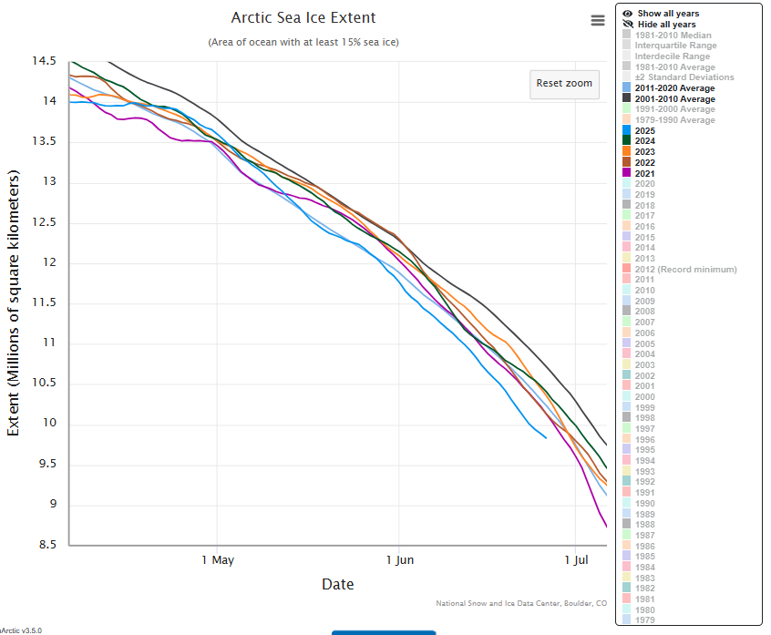
After a brief period of becoming the lead ice building year of the current decade (from 2021) towards the end of April, the bright blue line of 2025 gradually sank towards the previous 10-year average, the less bright blue line, and went below it again just before the end of May, remaining there throughout June. But in the last couple of days the line has turned slightly back toward that average line again.
What does this mean? Well, for me, it is quite important to my ongoing theory and my monthly update on how that is going – due in about five days. Not critically important, because we should never look at data for individual years, but there is good news anyway. I have calculated that if the blue 2025 data line crosses the 1 July vertical line at anywhere above 9.1 million Km2, which looks quite likely now, we will have another positive result (above the dull blue average line for the previous decade – 2011-2020) for the average of a third straight month this year in the current decade.
If you are new to my monthly sea-ice posts, my theory is that the fairly rapid expansion of Arctic sea ice melting over the last several decades – and there is good reason to only measure this in decades – has been brought to a complete halt during the current decade – or the first five years of it that we have so far lived through. That theory has potentially momentous outflows if eventually seen to hold in an as yet unknown future, as I’m sure you can imagine. It chiefly wields an axe to the roots of the climate change alarmist lobby. Take it from me, there is no cause for alarm.
That’s all for now. Next monthly update July 2nd. The image, incidentally, and as always, is derived from the NSIDC Charctic Interactive Sea Ice Graph.

Leave a comment